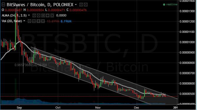
This is a daily chart. Each bar represents one day of trading. As you can see bitShares has been a orderly down channel for about four months now. But for the last week or so, the price has been flat. Notice how the price is bumping up against the top of that downward slopped trend channel. A breakout through that top line would be a VERY good sign.
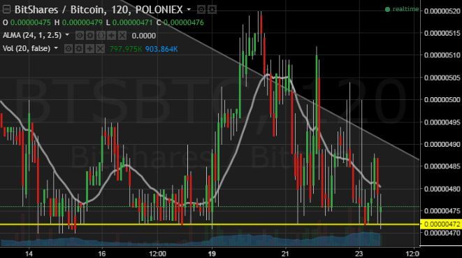
Here's a closer look. This is the same chart only each candle represents 2 hours of trading. There's that same gray trend channel. Only the top line is visible. And it looks like price has been trying to break through, but keeps coming back down into the channel. Now there's also support there, seen as the yellow line. If price breaks down through that yellow line, then a new bottom may be likely.
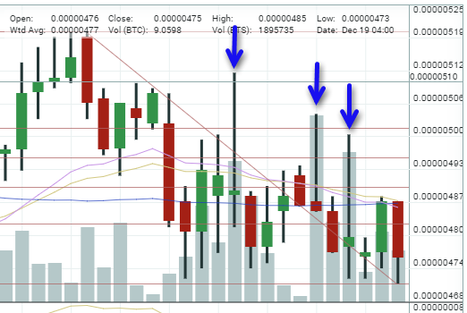
Now this very interesting. Here's a 4 hour chart from Poloniex. This is just about 4 days of trading. Notice where I've placed the blue arrows. These candles all represent significant moves up. But then someone... seeing the price was moving up on good volume saw that as a good opportunity to sell a large stake, immediately pushing the price back down again. No way to know who this is, but the pattern is quite obvious.
 Topic: bitShares Charts (technical analysis) (Read 1792 times)
