Here is the corrected pixel sized banner for this one...
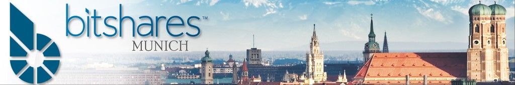
great .. if you would scale down the BitShares B a bit more ( more whitespace) .. it would be perfect IMO 
Agreed.
This is the new best IMO. Maybe we could use the bitshares logo that has the "b" built in to it with the greenish "bit"? You know, the logo Cass did that I have on our tri-fold flyers..
The white gradient is a good idea too, as it offset the logo and added much needed "punch" to it.
A more elegant font for "Munich" is needed, Times New Roman is ok, but it's so common..
Cass, delulo, xeroc... Those mountains don't exist, right? If I head south or east they do (Traunstein area, etc), but I have never noticed them from Marienplatz area.. When you walk around in town, you don't see any nature at all beyond the tall buildings that surround you.

 Topic: [JOB BOARD] Expert Graphic Artist wanted. Comp: 5,000BTS! status:CLOSED (Read 15964 times)